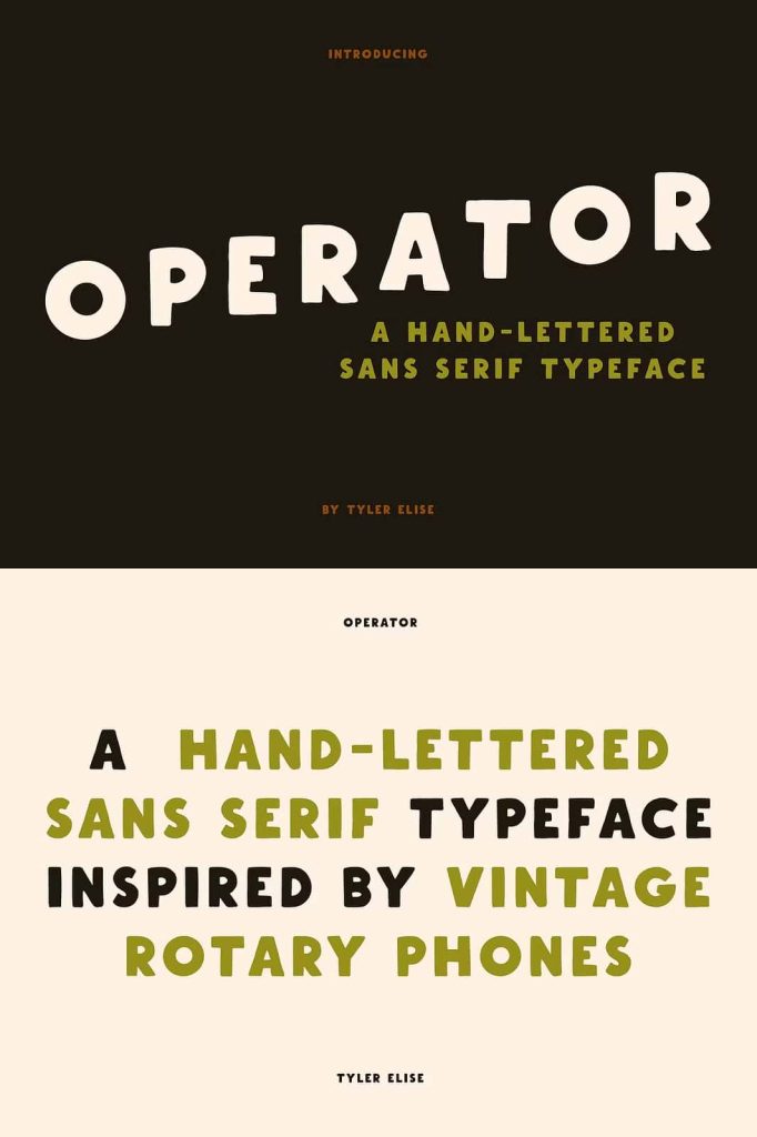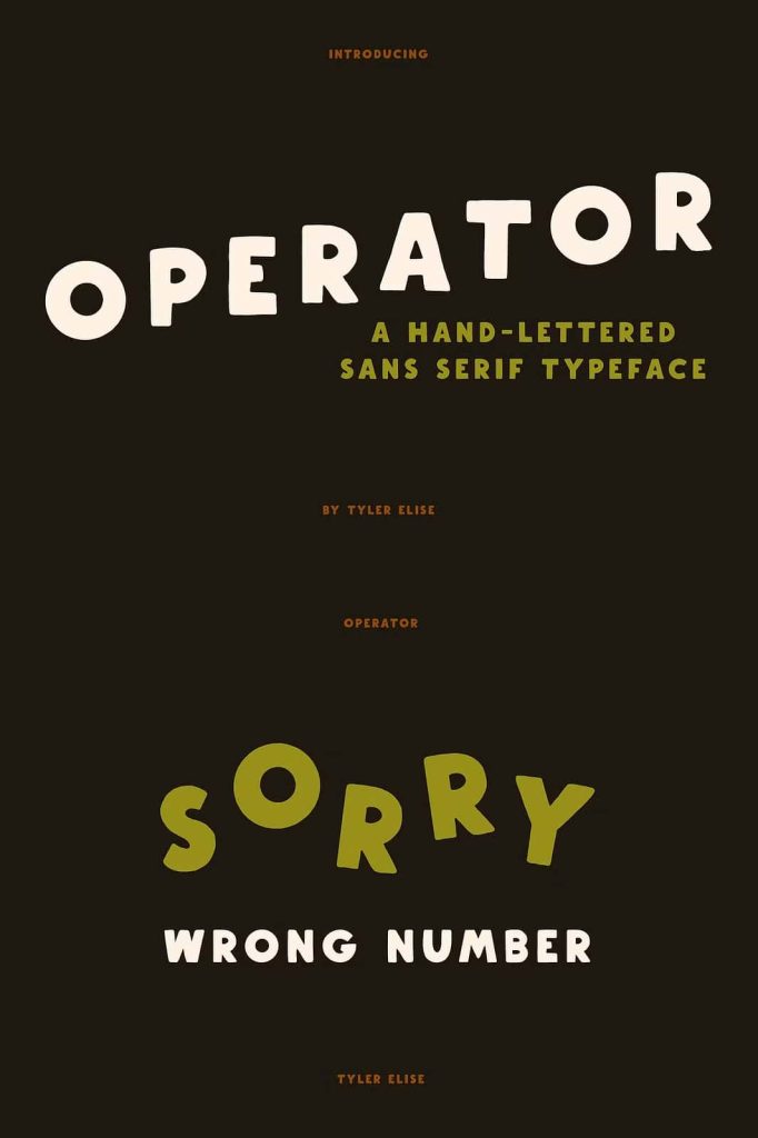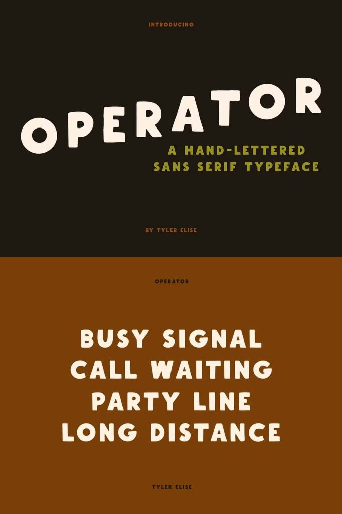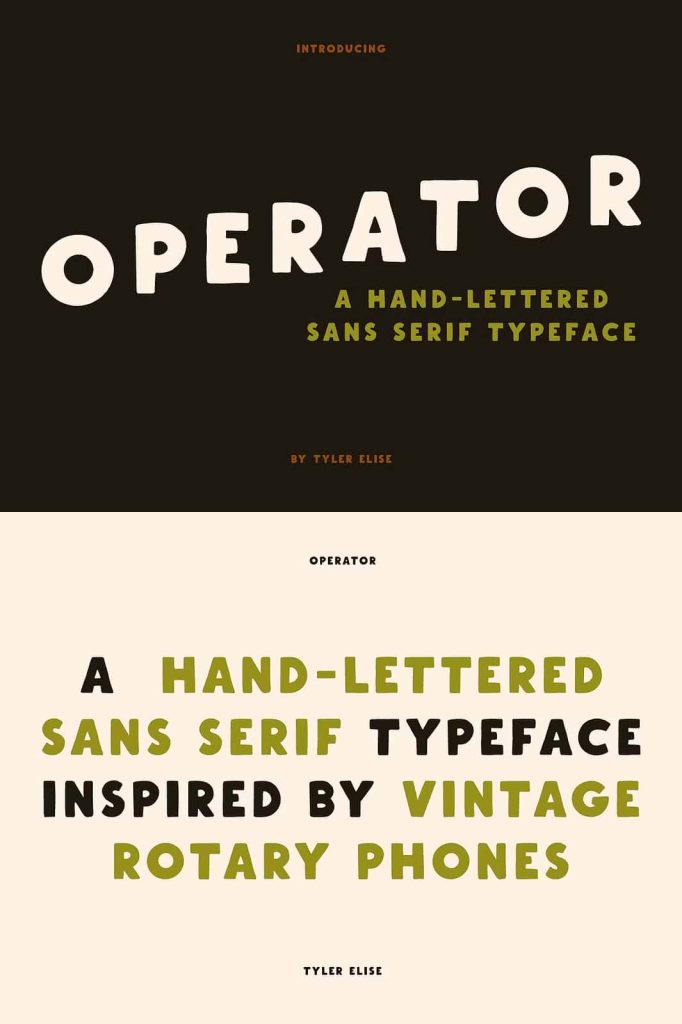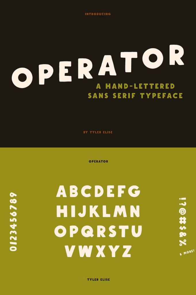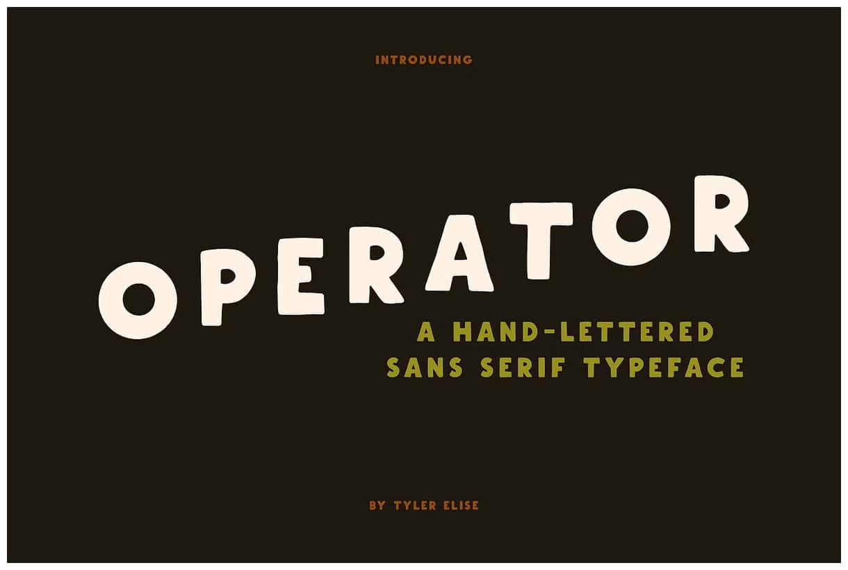
Operator is a chunky sans serif typeface designed to make a strong visual statement. Inspired by the rotary phones of the mid-20th century, this bold font captures the confident, mechanical precision of vintage communication devices while delivering a modern usability that fits perfectly into today’s digital and print designs. With its sturdy lines and geometric forms, Operator creates an instant sense of nostalgia and authority that transforms ordinary text into something memorable.
The Origins of Operator’s Design
The Operator font takes its inspiration from the early era of industrial design — a time when simplicity met function, and every curve had a purpose. The aesthetic roots lie in the sturdy dials of old rotary phones, where numbers and letters needed to be clear, readable, and full of character. This same clarity and confidence are built into Operator’s design, making it a perfect fit for logos, posters, packaging, and branding projects that need a hint of vintage flair without sacrificing legibility.
Every stroke in Operator is crafted to command attention. The wide letterforms and solid proportions exude reliability, while the balanced spacing keeps the type clean and easy to read. Whether used for headlines or bold display text, Operator’s visual weight adds authority and presence to any layout.
Why Designers Love Operator
Designers choose Operator for its powerful impact and versatile personality. The font offers a perfect blend of nostalgia and modern design sensibility. Its bold, structured appearance gives a sense of trust and craftsmanship — qualities that resonate strongly across industries, from fashion and editorial design to tech branding and signage.
Operator’s charm lies in its versatility. It pairs beautifully with minimalist layouts, muted color palettes, and textured backgrounds. When combined with softer serif or handwritten fonts, it creates dynamic contrast that elevates visual storytelling. Its clean geometry ensures that it scales gracefully, whether displayed on a large storefront sign or small web banner.
Ideal Uses for Operator
- Branding: Establish a bold and memorable identity with Operator’s strong letterforms.
- Posters and Print: Make headlines pop with a font that demands attention.
- Packaging: Give your product a retro yet professional look that stands out on shelves.
- Web Design: Use Operator for hero text or call-to-action sections to drive engagement.
- Editorial Projects: Add vintage charm to magazine titles, zines, or promotional materials.
The Timeless Appeal of Retro Fonts
Retro fonts like Operator tap into the power of nostalgia — a design trend that connects the viewer emotionally with the past while keeping the overall look fresh and relevant. In an age of sleek, minimalist aesthetics, a bold vintage font brings warmth and authenticity. Operator achieves this balance effortlessly, merging vintage influences with modern precision.
By choosing the Operator font, designers infuse their work with a distinctive personality that stands out in crowded visual spaces. Its commanding presence and timeless charm remind us that great design never goes out of style — it just evolves.
Conclusion
Operator isn’t just another sans serif. It’s a tribute to the mechanical elegance of the past and a tool for modern creators who value clarity, boldness, and personality. With its sturdy build, clear readability, and rich retro roots, Operator is more than a typeface — it’s a design statement that captures attention and leaves a lasting impression.
Whether you’re designing a brand identity, crafting editorial layouts, or creating standout headlines, Operator gives your project the confident voice it deserves. Its timeless look and strong geometric design ensure your message is delivered with impact, style, and unmistakable charm.