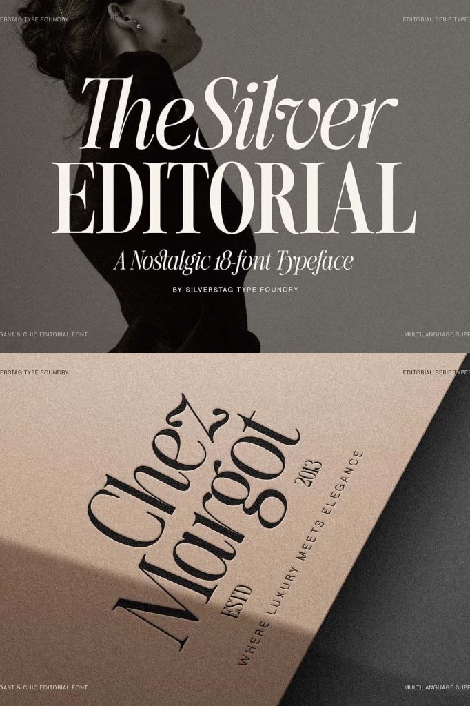
The Silver Editorial: A Refined Nostalgic Serif Typeface Family
The Silver Editorial is a beautifully reimagined serif typeface family that blends nostalgic charm with modern precision. Originally celebrated as one of the most popular serif designs, this expanded and fully redrawn edition transforms the font into a complete and versatile typographic system. With a total of 18 fonts, including nine weights and matching italics, The Silver Editorial is designed to deliver both visual beauty and functional performance across a wide range of creative and professional projects.
A Nostalgic Typeface Rebuilt for Modern Design
The Silver Editorial draws inspiration from classic editorial typography, where elegance, readability, and personality work together seamlessly. This nostalgic influence gives the typeface its timeless character, evoking the refined atmosphere of traditional print publications while remaining relevant in contemporary design contexts.
In this latest edition, every letterform has been carefully redrawn to improve balance, spacing, and consistency. The result is a serif typeface that preserves its original charm while offering improved clarity and performance for modern workflows.
An Expanded 18-Font Typographic System
This refined version of The Silver Editorial now includes a complete set of 18 fonts, providing designers with exceptional flexibility. The family features nine carefully calibrated weights, each paired with a corresponding italic style. This extensive range allows designers to build complex typographic hierarchies and expressive layouts without leaving the same font family.
From delicate, lightweight text to bold, commanding headlines, The Silver Editorial supports a wide spectrum of visual tones while maintaining a cohesive identity.
Elegant Italics Designed for Real Use
The italic styles in The Silver Editorial are not simple slanted versions of the roman fonts. They are thoughtfully designed to complement the upright styles while adding movement and emphasis. These italics enhance readability and bring a graceful rhythm to editorial layouts, quotes, and highlighted text.
Designers can rely on the italics to add nuance and contrast while preserving consistency throughout the design system.
Designed for Beauty and Built for Function
Refined Letterforms with Purpose
The Silver Editorial balances aesthetic elegance with practical usability. Each letterform is designed to look beautiful while performing reliably across different sizes and formats. The refined serifs, smooth curves, and well-considered proportions ensure that the font remains readable and visually pleasing in both display and text applications.
This thoughtful construction makes the typeface suitable for long-form reading as well as impactful headlines.
Consistent Spacing and Structure
The upgraded spacing and kerning improve overall readability and flow. Text set in The Silver Editorial feels comfortable and natural, reducing visual fatigue in extended reading contexts. This attention to detail supports professional publishing standards and modern design expectations.
Perfect for Editorial and Publishing Design
As its name suggests, The Silver Editorial excels in editorial and publishing environments. It performs beautifully in magazines, newspapers, books, and digital publications. Designers can use it for headlines, subheadings, pull quotes, captions, and body text, creating cohesive and engaging layouts.
The nostalgic tone adds depth and personality to editorial content while the modern refinements ensure clarity and usability.
Strong Choice for Branding and Visual Identity
The Silver Editorial also serves as a powerful tool for branding and visual identity. Its refined serif style communicates trust, sophistication, and authority, making it ideal for luxury brands, cultural institutions, publishers, and creative businesses.
Logos and brand assets created with The Silver Editorial feel established and confident, while the wide range of weights allows for flexible brand expression across different platforms.
Versatile Across Print and Digital Media
This typeface family adapts seamlessly to both print and digital environments. In print, it delivers crisp, elegant typography with a classic feel. On screens, the refined letterforms and improved spacing ensure readability and visual consistency across devices.
Designers can confidently apply The Silver Editorial to websites, marketing materials, social media graphics, and promotional content.
A Typeface Family That Encourages Thoughtful Typography
The Silver Editorial invites designers to work with intention and care. Its complete typographic system supports thoughtful hierarchy, contrast, and rhythm. By staying within one family, designers can achieve visual harmony while exploring a wide range of expressive possibilities.
This approach simplifies workflows and enhances design consistency, making The Silver Editorial a reliable choice for professional projects.
Why Choose The Silver Editorial Typeface Family
The Silver Editorial stands as a refined evolution of a beloved serif typeface. With its nostalgic roots, fully redrawn letterforms, and expanded 18-font system, it delivers both beauty and functionality. The typeface supports editorial design, branding, and modern publishing with confidence and elegance.
If you are looking for a comprehensive serif typeface family that blends classic editorial charm with contemporary performance, The Silver Editorial offers a timeless and versatile solution for professional design work.