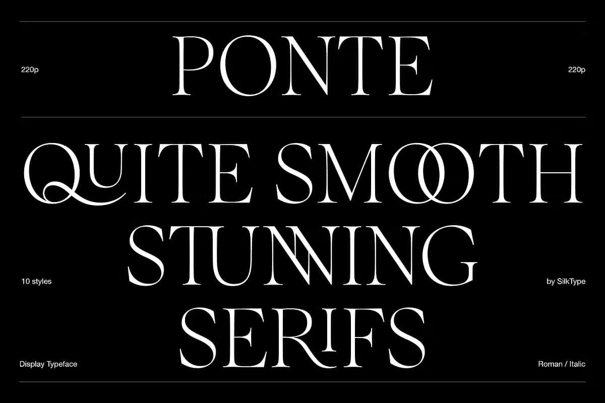

Ponte: A High-Contrast Display Typeface Built for Impactful Headlines
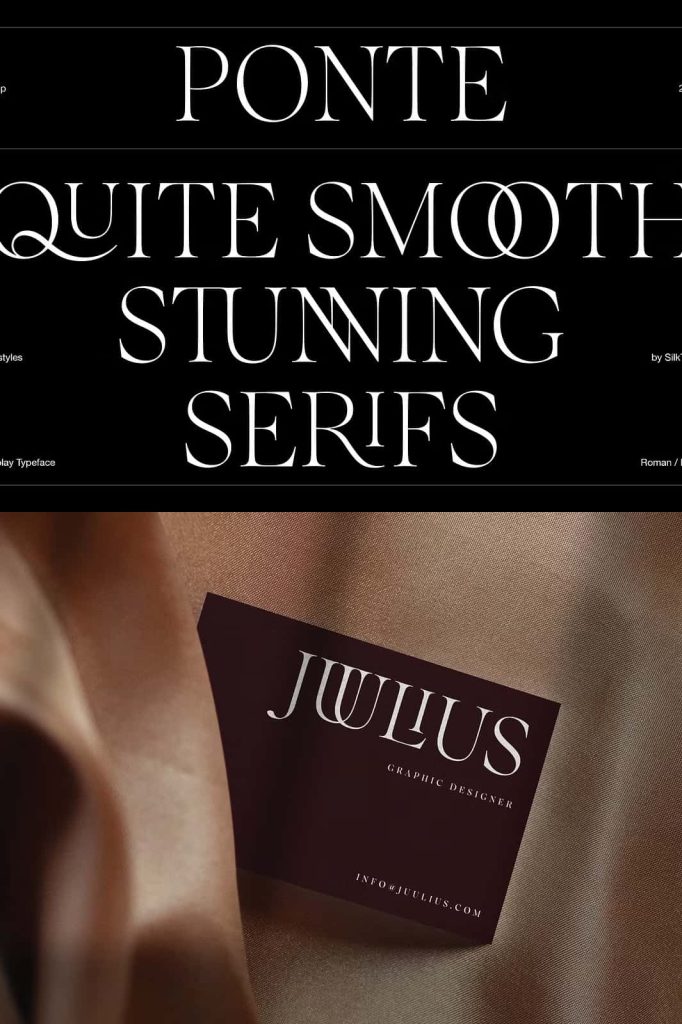
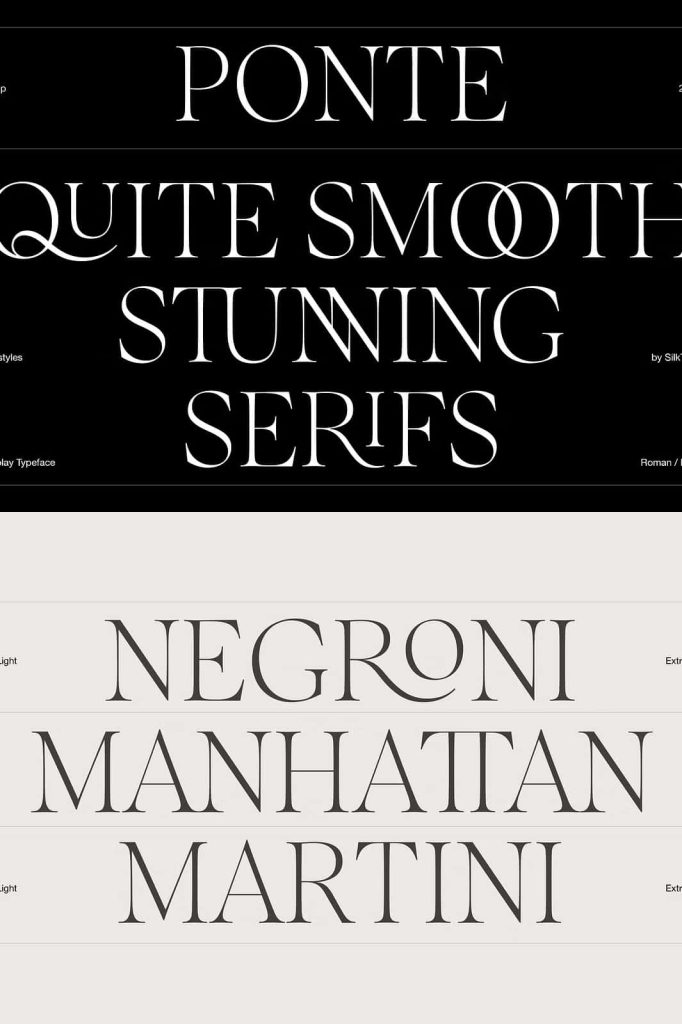
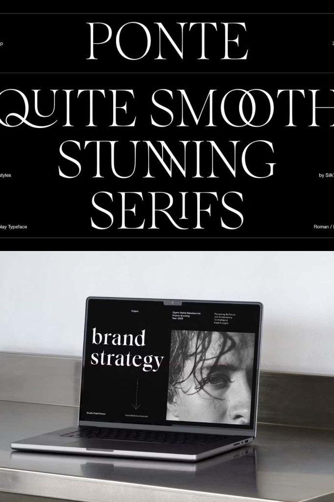
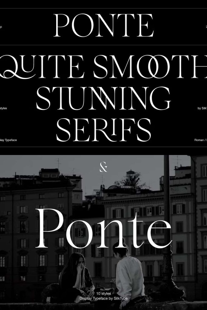
Ponte is a refined high-contrast display typeface created to command attention and elevate visual communication. Designed with smooth, elegant serifs and carefully balanced proportions, Ponte brings clarity, drama, and sophistication to headline-driven layouts. This typeface is engineered to perform at display sizes, where contrast, detail, and expressive typography matter most.
High Contrast That Creates Visual Authority
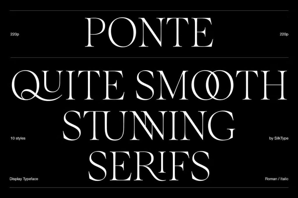
At the core of Ponte’s identity lies its striking contrast between thick and thin strokes. This contrast delivers immediate visual impact, allowing headlines to stand out with confidence and precision. The dramatic stroke transitions add rhythm and movement to each word, guiding the reader’s eye and reinforcing hierarchy within the layout.
Despite its bold contrast, Ponte maintains excellent readability. The smooth serifs and carefully shaped counters prevent the letterforms from feeling sharp or overwhelming. This balance ensures that the typeface feels elegant rather than aggressive, making it suitable for sophisticated design applications.
Smooth Serifs with Refined Craftsmanship
Ponte’s serifs are designed with smooth curves and controlled details that soften the overall appearance. These serifs enhance the typeface’s elegance while supporting clarity at large sizes. The refined construction reflects a strong attention to typographic craftsmanship, ensuring that every character feels intentional and polished.
This smooth serif approach allows Ponte to bridge classic and contemporary design sensibilities. Designers can achieve a timeless look while still delivering a modern and expressive typographic voice.
Ten Styles Across Five Versatile Weights
Ponte offers ten total styles, combining roman and italic versions across five distinct weights. The range spans from extra light to bold, giving designers extensive control over emphasis, hierarchy, and tone. Each weight maintains consistent proportions and character, allowing seamless transitions within a single project.
The lighter weights bring elegance and restraint, ideal for refined headlines and editorial accents. The heavier weights deliver strength and authority, making them perfect for bold titles and statements. This range ensures that Ponte adapts easily to a variety of creative directions.
Roman and Italic Styles for Expressive Layouts
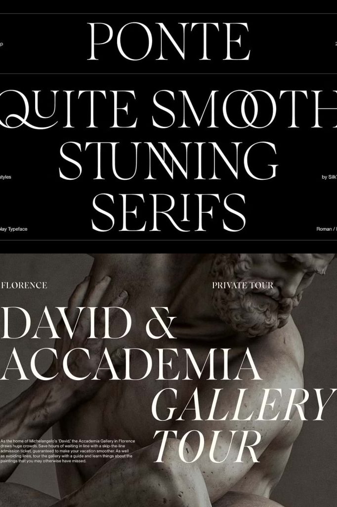
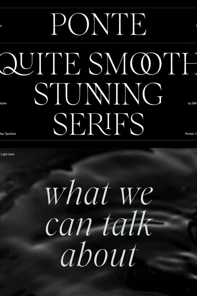
Both roman and italic styles are included across all five weights, expanding the expressive potential of the typeface. The italics introduce fluidity and motion, adding emphasis and contrast without breaking visual cohesion. These italics work beautifully for quotes, highlights, and editorial storytelling.
The harmonious relationship between roman and italic styles ensures consistency throughout complex layouts, supporting both readability and creative expression.
Over 80 Decorative Ligatures for Unique Typography
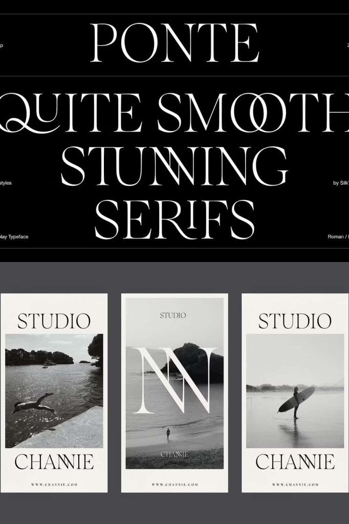
Ponte includes more than 80 decorative ligatures, offering designers the ability to create distinctive and custom-looking typography. These ligatures enhance letter connections and introduce subtle ornamental details that elevate the overall aesthetic. When activated, they add personality and sophistication without overwhelming the design.
The ligatures are especially effective in display text, logos, and headlines where typographic detail makes a strong impression. They help reduce repetition and create a more fluid and engaging reading experience.
Designed for Sophisticated Design Applications
Editorial Design and Headlines
Ponte excels in editorial environments where headlines must communicate authority and style. Its high contrast and elegant structure make it ideal for magazines, journals, and digital publications that value strong typographic identity. Designers can rely on Ponte to anchor layouts and enhance storytelling.
Branding, Logos, and Visual Identity
In branding and logo design, Ponte delivers a premium and confident tone. The smooth serifs and decorative ligatures help create memorable wordmarks and brand signatures. This makes the typeface suitable for fashion, luxury products, cultural institutions, and creative brands that want to project sophistication.
Posters, Campaigns, and Promotional Design
For posters and promotional materials, Ponte provides strong visual presence and flexibility. Its range of weights and styles allows designers to build dynamic compositions while maintaining a cohesive look. Headlines feel intentional, bold, and refined across both print and digital formats.
Versatile Performance Across Print and Digital Media
Ponte performs reliably across print and digital platforms. Its precise construction ensures clean rendering at large sizes, while the strong contrast preserves clarity on screens. Designers can confidently use Ponte in websites, social media graphics, packaging, and print materials.
The typeface pairs effectively with minimalist sans-serif fonts or understated serif companions, allowing Ponte to take the lead without visual competition.
Why Choose Ponte for Your Typography System
Choosing Ponte means selecting a display typeface that combines elegance, flexibility, and expressive power. Its high contrast, smooth serifs, extensive ligatures, and wide range of styles provide designers with the tools needed to create sophisticated and memorable designs.
If you are looking for a high-contrast display typeface that delivers impactful headlines and refined visual identity, Ponte offers a complete and versatile solution for modern, type-focused design projects.