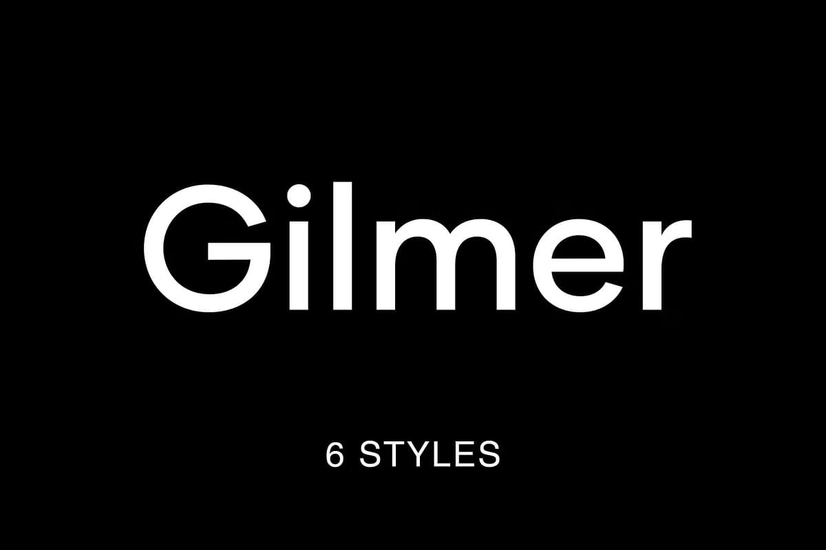

Gilmer – A Modern Geometric Sans-Serif Font with Timeless Precision
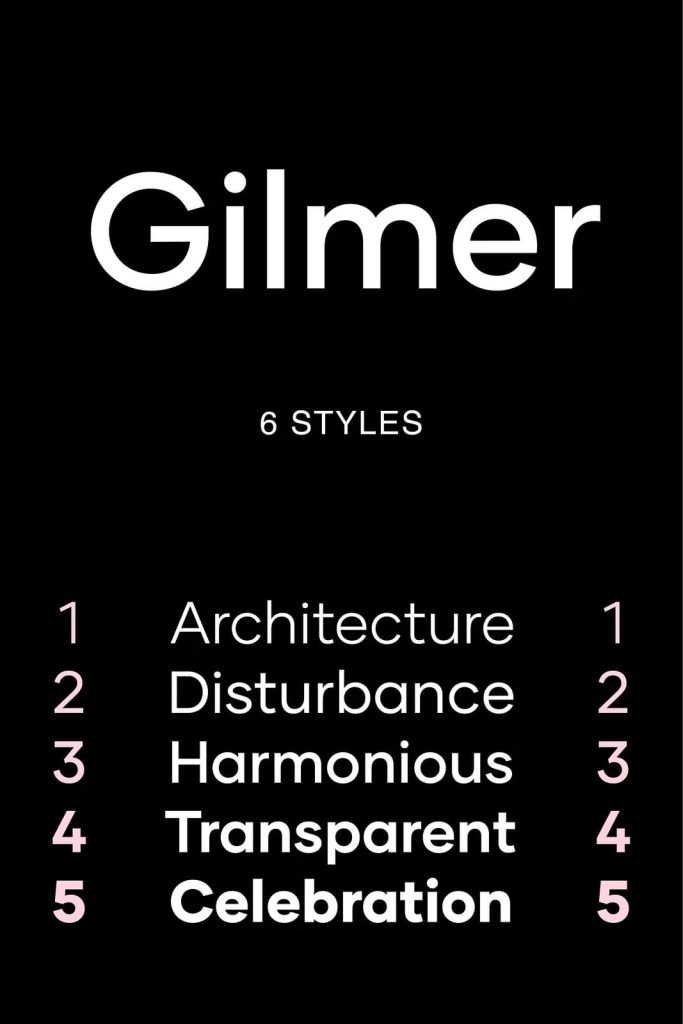
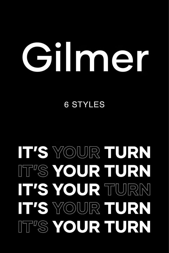
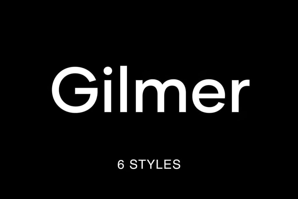
Gilmer is a clean and contemporary geometric sans-serif font family designed with precision, balance, and timeless style. Drawing inspiration from iconic typefaces like Futura and Avant Garde, Gilmer combines the elegance of geometric design with modern readability. Its high x-height, sharp edges, and low stroke contrast give it a powerful visual presence—perfect for designers who value both clarity and creativity. Whether used in print or digital media, Gilmer delivers sophistication and impact with effortless ease.
Inspired by Mid-Century Modern Type Design
Gilmer pays homage to the modernist typography of the 20th century, a period defined by geometry, simplicity, and functional design. Inspired by classic typefaces such as Futura and Avant Garde, Gilmer brings a refreshed take on those timeless aesthetics. The typeface’s clean circular forms, even spacing, and consistent stroke weight reflect the design principles of the Bauhaus movement, making it a perfect blend of historical influence and contemporary refinement. This balance allows Gilmer to adapt seamlessly across styles, from minimalist branding to editorial layouts.
Distinctive Features for Strong Visual Identity
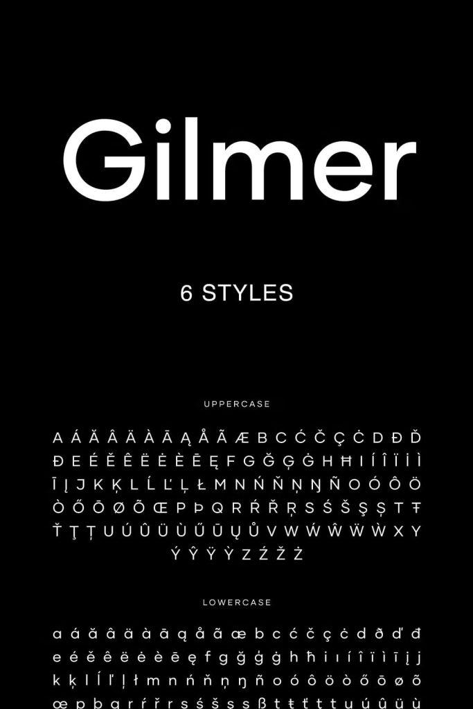
What sets Gilmer apart from other sans-serifs is its distinctive structure. The large x-height enhances legibility, especially in smaller text sizes, while the geometric proportions ensure consistent rhythm and flow. The sharp edges and minimal stroke contrast create a crisp, modern feel, ideal for brands that want to convey confidence and precision. Each letterform is built on pure geometry, giving Gilmer a harmonious appearance that remains balanced and visually striking in both uppercase and lowercase settings.
A Versatile Typeface for Every Design Application
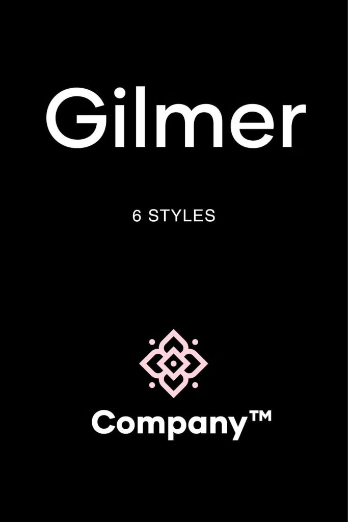
Designed with versatility in mind, Gilmer performs beautifully across a variety of design contexts. Its clean, structured lines make it suitable for magazines, posters, websites, corporate branding, and advertising. In editorial design, Gilmer brings clarity and sophistication to headlines and subheadings. In branding, it communicates professionalism and modernity. For digital platforms, its geometric precision ensures legibility and aesthetic harmony across screens and resolutions. Whether you’re creating minimalist layouts or bold, expressive visuals, Gilmer adapts effortlessly to your needs.
Perfect Harmony Between Form and Function
Gilmer was designed to balance function and style. The minimal contrast and even weight distribution give it a neutral tone, while the geometric foundation ensures visual strength and stability. This makes it equally effective in both text-heavy documents and display applications. The typeface feels strong and intentional without appearing rigid, allowing designers to use it creatively while maintaining a professional tone. Gilmer’s precision and simplicity make it a reliable choice for brands that value timeless design and visual clarity.
Modern Elegance with a Human Touch
Although Gilmer is rooted in geometric structure, it still retains a subtle warmth that keeps it from feeling mechanical. The proportions of its letterforms strike the perfect balance between modern minimalism and human approachability. This versatility makes Gilmer suitable for both corporate and creative industries. Its ability to look sharp in digital environments and refined in print ensures that your projects maintain a cohesive visual language across all mediums.
Optimized for Professional Designers and Brands
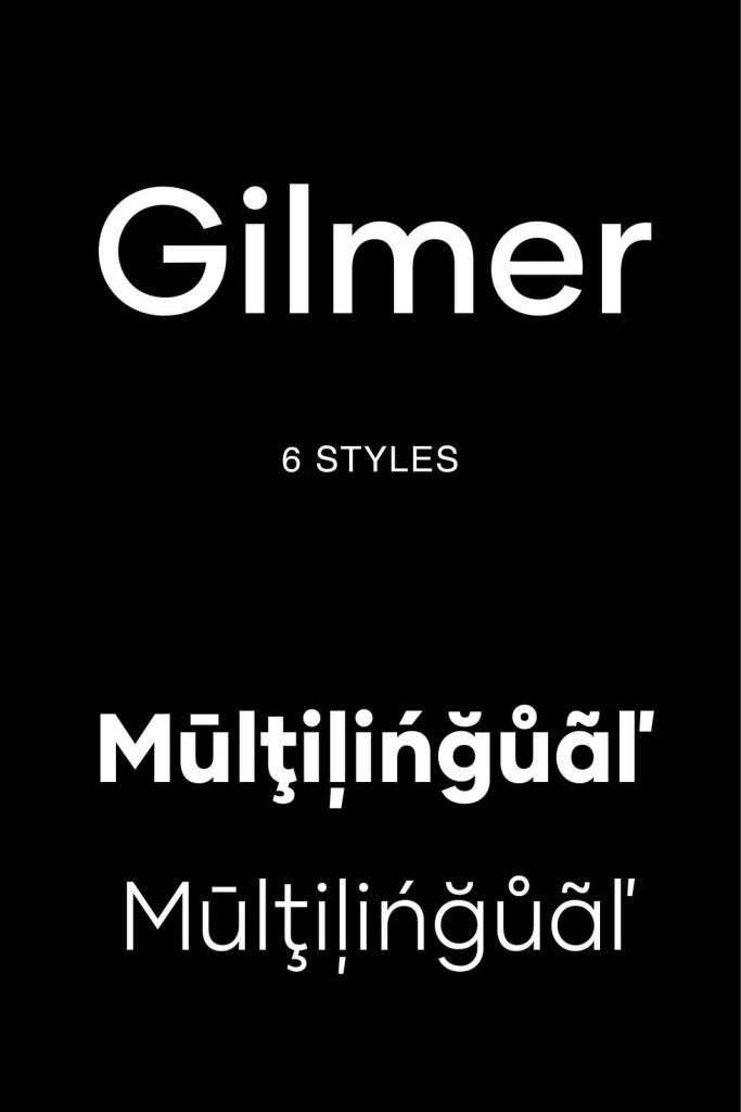
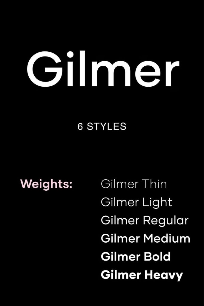
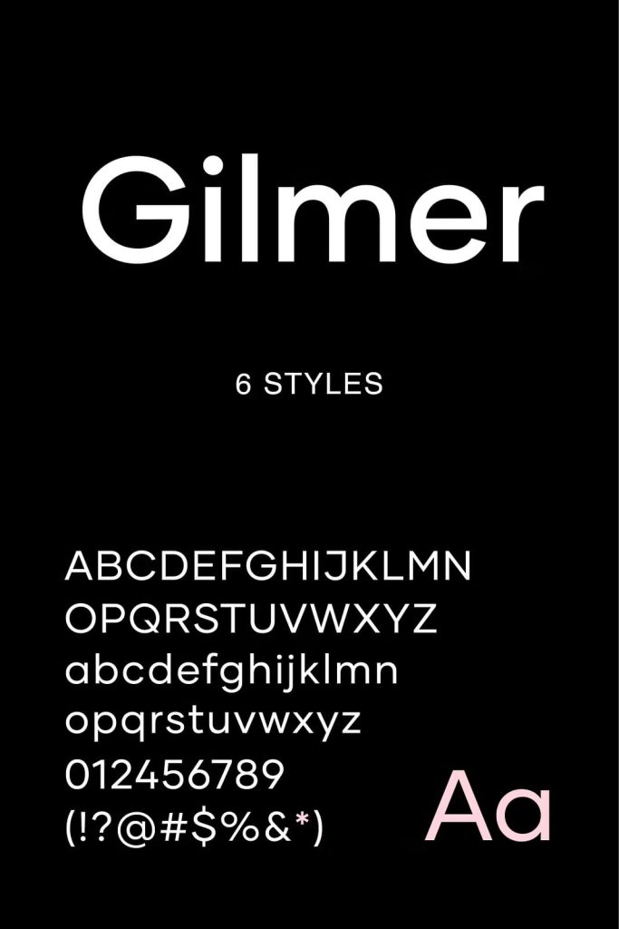
Gilmer isn’t just a typeface—it’s a design tool built for creative professionals. With multiple weights and a wide character set, it gives designers full flexibility to experiment with hierarchy, contrast, and tone. Whether you’re creating logos, packaging, user interfaces, or promotional materials, Gilmer provides the control and consistency you need to deliver polished, professional results. It’s a dependable choice for brands that demand excellence in every detail.
Why Choose Gilmer for Your Next Project?
Choosing Gilmer means embracing a typeface that merges modern geometry with timeless design. It captures the essence of mid-century minimalism while offering the versatility needed for today’s creative landscape. Every curve, counter, and corner was crafted to ensure harmony and legibility, making Gilmer ideal for long-form text as well as bold display work. Its geometric precision, functional balance, and subtle personality make it a must-have font for designers who want their work to feel sophisticated and forward-thinking.
Bring precision, elegance, and modern clarity to your next project with Gilmer—the geometric sans-serif font that defines versatility and timeless appeal in one beautifully crafted type family.