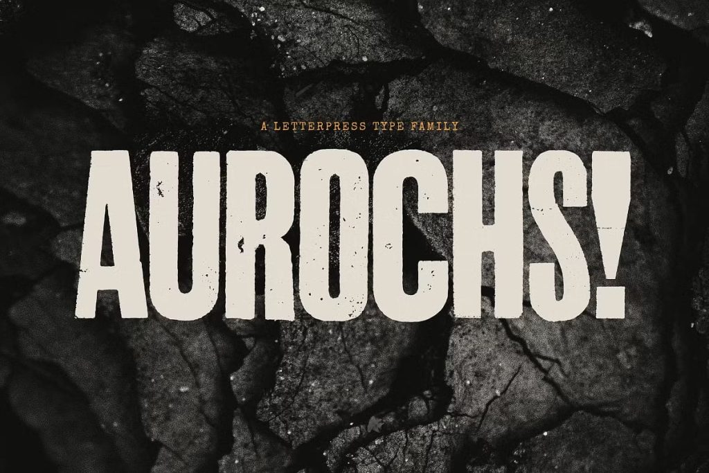
Aurochs: A Vintage Display Type Family with Raw Typographic Energy
Aurochs is a bold and expressive display type family that draws its strength from the raw beauty of early printmaking. Developed from detailed scans of vintage letterpress and woodblock prints, this type family captures the handmade spirit of historical typography while offering modern designers a powerful and flexible creative tool. With six distinctive weights, Aurochs delivers character, texture, and visual impact that immediately command attention.
Inspired by Vintage Letterpress and Woodblock Printing
The foundation of Aurochs lies in authentic historical sources. Each letterform originates from real scans of vintage letterpress and woodblock prints, preserving the tactile qualities and irregularities of early printing techniques. These influences give the font its unmistakable texture and depth, allowing designers to recreate the feel of ink pressed into paper.
Unlike digitally perfect typefaces, Aurochs embraces the marks of craftsmanship. Slight inconsistencies, rough edges, and uneven forms contribute to its authentic appearance, making it ideal for projects that value heritage and personality.
A Typeface That Evokes the Typographic Wild West
Aurochs channels the energy of what can be described as the original typographic wild west. During this era, letterforms were created by hand, often without strict standardization. Different weights, styles, and proportions were mixed freely, resulting in compositions that felt bold, experimental, and expressive.
This spirit of experimentation lives on in Aurochs. The font reflects a sense of controlled chaos, where mismatched elements come together to form cohesive and visually striking typography. Designers can use this quality to create layouts that feel dynamic, raw, and full of life.
Six Weights for Creative Freedom
Aurochs includes six carefully developed weights, giving designers the ability to build hierarchy and contrast while maintaining a consistent visual language. Each weight retains the same handcrafted character, ensuring cohesion across headlines, subheadings, and display text.
This range of weights allows designers to experiment with scale and emphasis. From lighter weights that introduce texture without overpowering the layout to heavier weights that deliver bold impact, Aurochs supports a wide variety of creative directions.
Handmade Imperfection with Purpose
The beauty of Aurochs lies in its imperfections. These are not flaws but intentional design features that reflect the realities of early printing. Uneven strokes, irregular spacing, and subtle distortions create a sense of authenticity that modern, polished fonts often lack.
This handcrafted quality helps designs feel human and expressive. Aurochs communicates honesty, tradition, and creative freedom, making it particularly effective for projects that seek emotional connection and visual storytelling.
Perfect for Editorial Design
Bold Headlines and Feature Text
In editorial design, Aurochs excels as a headline and display typeface. Its strong presence and textured forms draw readers in, making it ideal for magazine covers, feature articles, and editorial spreads. The font adds depth and personality while supporting clear hierarchy.
Designers can use different weights to guide readers through content, creating engaging and visually rich layouts that feel curated and intentional.
Expressive Typography Systems
Aurochs works well within expressive typographic systems where contrast and character matter. When paired with clean serif or sans-serif fonts for body text, it creates compelling visual contrast that enhances readability and impact.
Distinctive Branding and Visual Identity
Aurochs is a powerful choice for branding projects that want to communicate authenticity, heritage, or creative independence. Its raw and handmade aesthetic suits craft brands, breweries, music labels, bookstores, and creative studios seeking a distinctive visual voice.
Logos and brand marks created with Aurochs feel bold and memorable, standing apart from overly polished corporate identities. The font helps brands express individuality and confidence.
High-Impact Posters and Promotional Design
For posters and promotional materials, Aurochs delivers immediate visual impact. Its textured letterforms and bold shapes capture attention from a distance, making it ideal for event posters, exhibitions, concerts, and cultural promotions.
The controlled chaos of the typeface adds energy and movement, helping designs feel dynamic and expressive rather than static or predictable.
Versatile Across Print and Digital Media
Although inspired by historical printing techniques, Aurochs adapts effectively to modern print and digital applications. In print, its textured forms shine with tactile richness. In digital environments, the font retains its character while remaining legible and impactful.
Designers can confidently apply Aurochs across posters, websites, social media graphics, and marketing materials, ensuring consistent visual identity across platforms.
Why Choose Aurochs for Your Typeface Collection
Aurochs offers a unique blend of historical authenticity and modern usability. Its six weights, handcrafted imperfections, and bold display style give designers a powerful tool for expressive typography. The font celebrates the raw energy of early printmaking while supporting contemporary design needs.
If you are looking for a vintage display type family that brings texture, character, and controlled chaos to editorial design, branding, and posters, Aurochs provides a compelling and distinctive solution for creative professionals.