
Editor’s Note Display – A Sharp, High Contrast Serif Font for Bold Design Statements
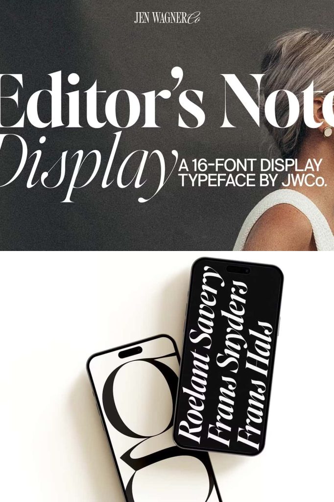
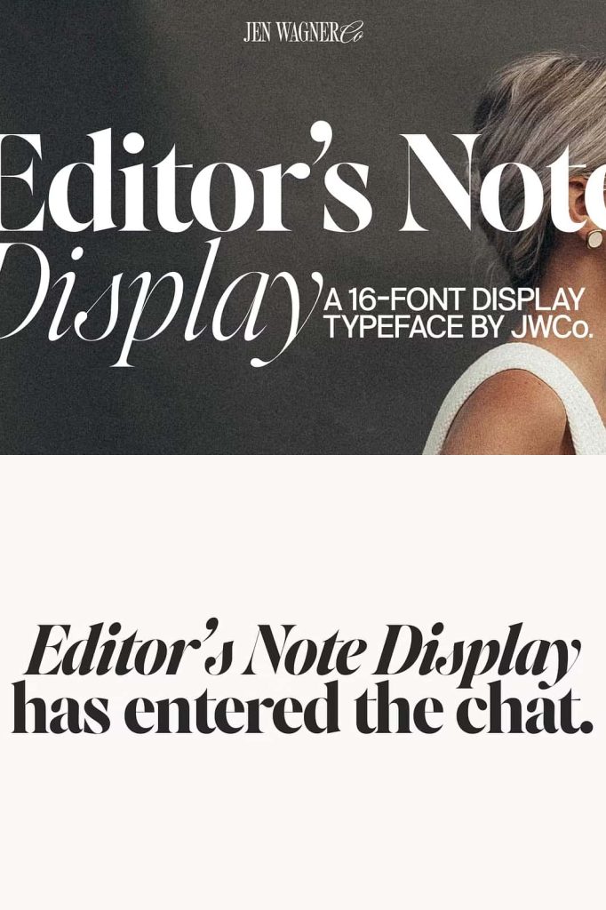
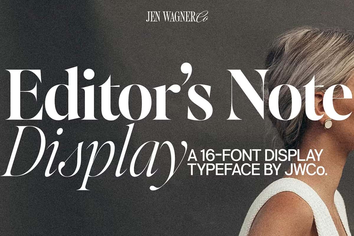
Editor’s Note Display is a refined high contrast display serif font designed to make a striking impression. As the bold and expressive partner to the beloved Editor’s Note and Editor’s Note Text families, this typeface amplifies elegance with precision. Every curve, point, and line has been meticulously crafted to deliver maximum visual impact, whether viewed in large-scale headlines or refined editorial compositions. It’s the font of choice for designers who demand sharpness, sophistication, and style in equal measure.
Designed with Precision and Purpose
Every detail in Editor’s Note Display has been fine-tuned to perfection. It takes the familiar, graceful forms of the original Editor’s Note and enhances them with razor-sharp edges and ultra-thin lines that push contrast to its limits. The result is a typeface that feels both daring and precise—ideal for modern design environments that value clarity and elegance. The careful balance between sharp points and smooth curves ensures the font remains legible even at extreme sizes, making it a versatile choice for digital and print use.
Exceptional Craftsmanship for Modern Typography
What sets Editor’s Note Display apart is its obsessive attention to detail. Each character has been sculpted to maintain harmony and rhythm, ensuring a consistent visual flow across all compositions. The letterforms are clean yet expressive, offering a perfect balance of tension and grace. The ultra-fine hairlines create a dramatic sense of contrast, while the strong stems and precise terminals give the font authority and presence. This combination makes it suitable for designers who want their typography to command attention without sacrificing beauty.
High Contrast and Visual Power
As its name suggests, Editor’s Note Display excels in high-contrast design. Its razor-thin lines and pronounced serifs create a dynamic visual rhythm that instantly elevates any layout. Whether you’re designing magazine covers, book titles, luxury branding, or web headers, this typeface transforms simple words into striking design elements. The crisp definition of each letter ensures that your typography looks clean, powerful, and professional even at large sizes, maintaining perfect proportion and optical balance.
Built for Impactful Display Use
Editor’s Note Display was created to perform beautifully in large settings. Unlike many high-contrast fonts that lose consistency when scaled up, this typeface retains its integrity and sophistication at any size. Designers can confidently use it for oversized titles, high-end packaging, posters, or editorial mastheads without distortion or imbalance. Its elegance makes it equally suitable for refined branding, while its sharp geometry gives it the boldness needed for modern creative industries. The font’s adaptability ensures that it enhances both minimal and intricate layouts.
A Perfect Complement to Editor’s Note and Editor’s Note Text
This display version builds on the legacy of the Editor’s Note family by providing a more dramatic and high-energy option. When paired with Editor’s Note Text for body copy, the combination creates seamless visual hierarchy and cohesion across all levels of design. Use Editor’s Note Display for striking headlines and Editor’s Note Text for readability and flow. Together, they deliver a balanced typographic system that captures both elegance and functionality.
Elevate Your Design with Confidence and Clarity
Editor’s Note Display is more than a font—it’s a design statement. It brings the poise and refinement of classic typography into the modern age, allowing every letter to convey clarity and intent. Whether you’re crafting luxury branding, minimalist layouts, or editorial masterpieces, this high contrast serif typeface adds polish, confidence, and visual drama to your work. Every curve tells a story of craftsmanship and precision, ensuring your message stands out with authority and grace.
Choose Editor’s Note Display to transform your typography into art. With its razor-sharp definition, impeccable proportions, and timeless sophistication, it remains one of the most powerful tools for designers who value both aesthetics and excellence in type design.